The Fairy Place
Client: The Fairy Place. An online & pop-up store created by Saoirse McGurrin, where handcrafted fairy house kits, handmade felt fairies & gnomes, and curated fairy letter kits cohabit. The Fairy Place is the place for all things magic.
Brief: Develop a cohesive visual identity and packaging system that captures the brand’s whimsical, handmade nature while maintaining consistency across all physical and printed touchpoints.
Approach
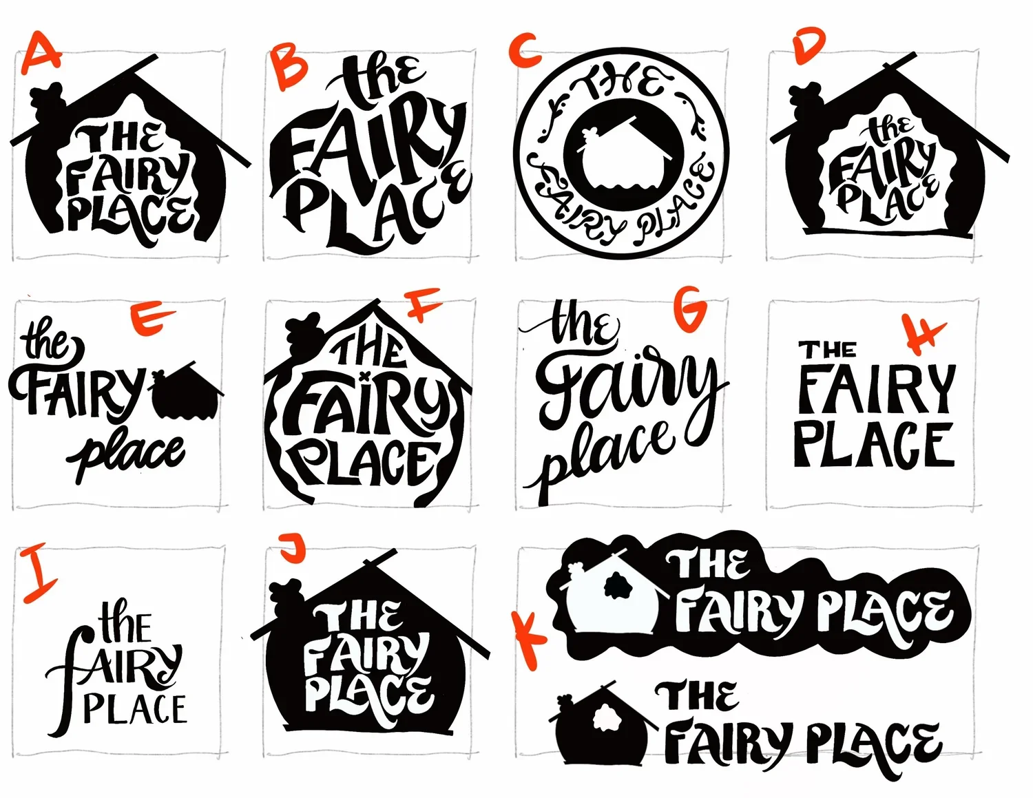
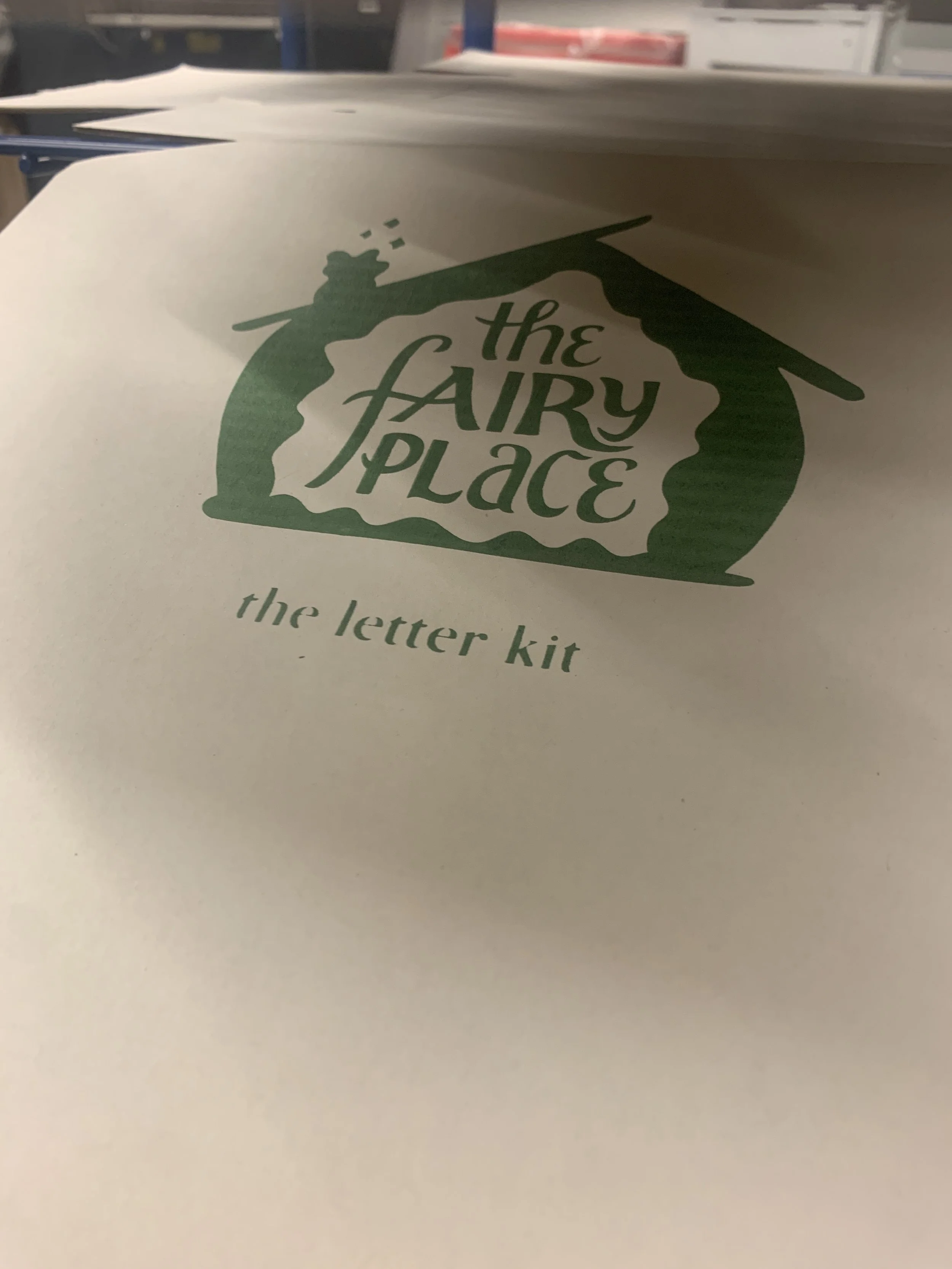
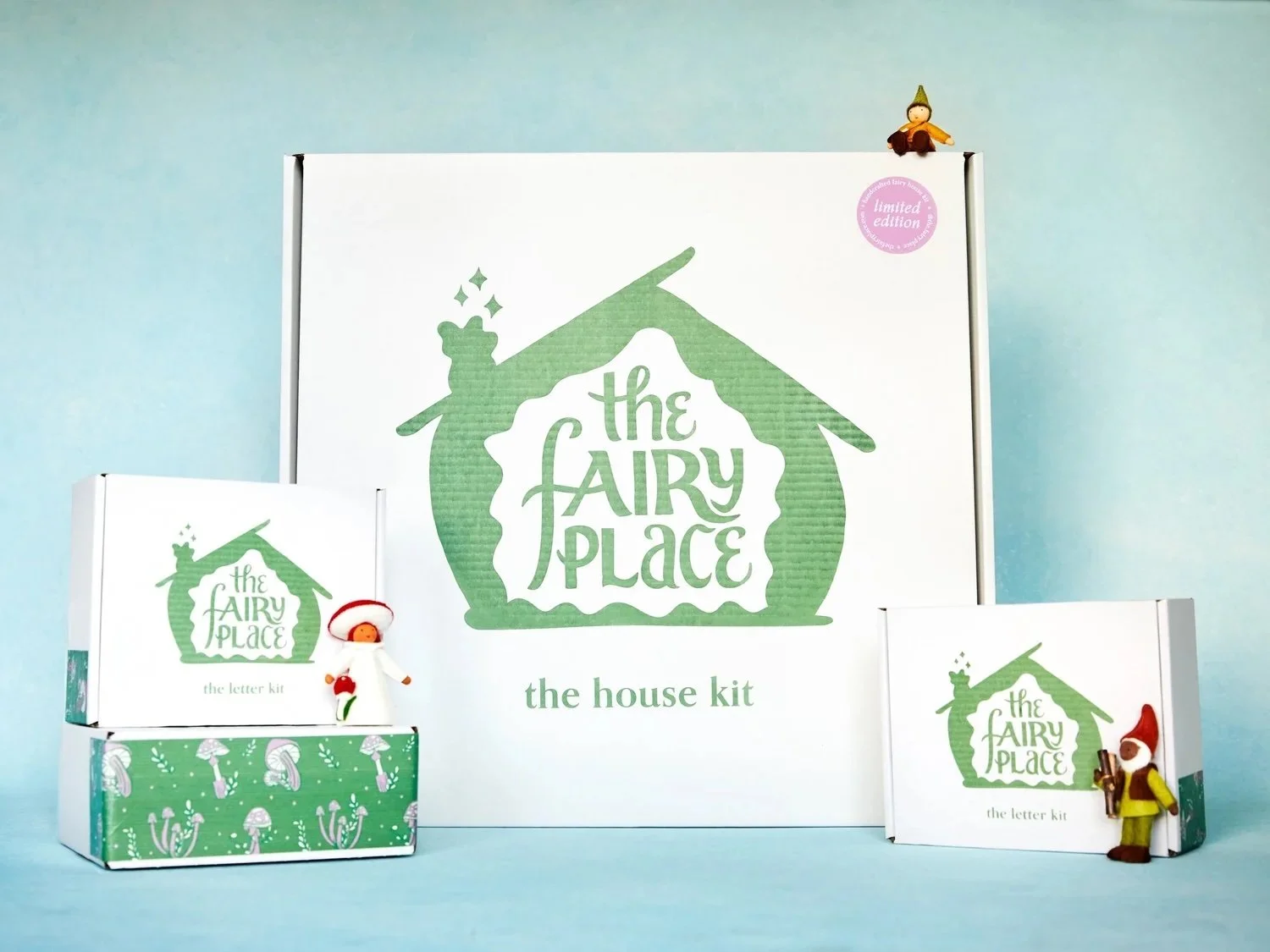
The design direction was inspired by the organic form of the fairy house—specifically its acorn-like shape and soft edges—which informed the logo and overall visual language. Custom lettering and symbolic elements, like the three stars, reinforce a sense of magic and playfulness.
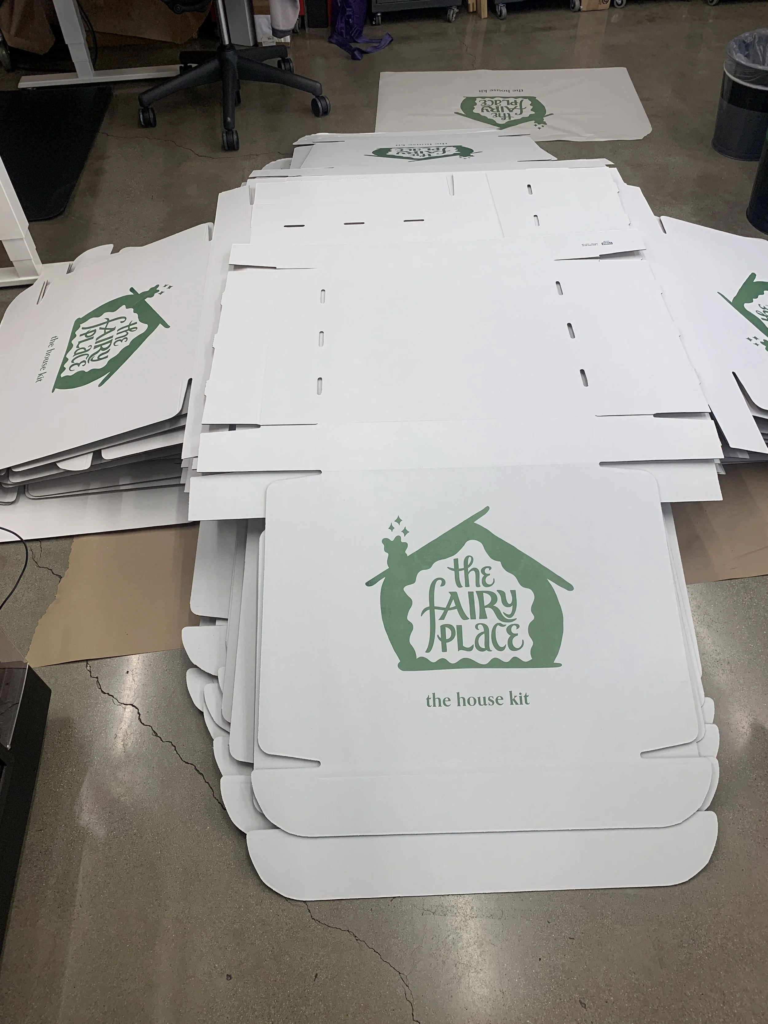
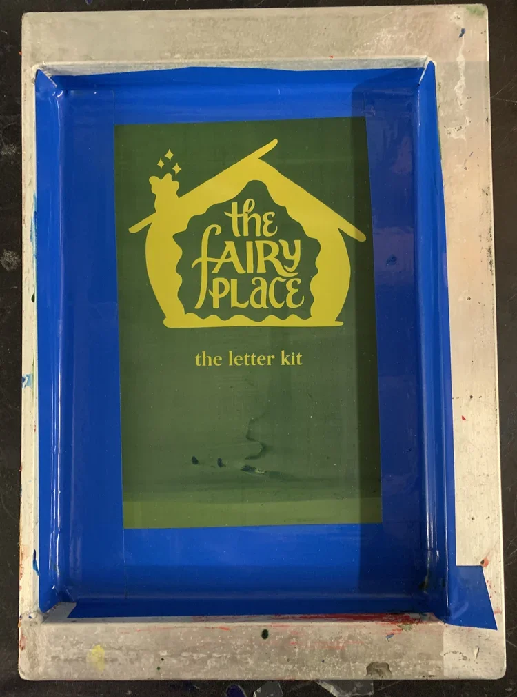
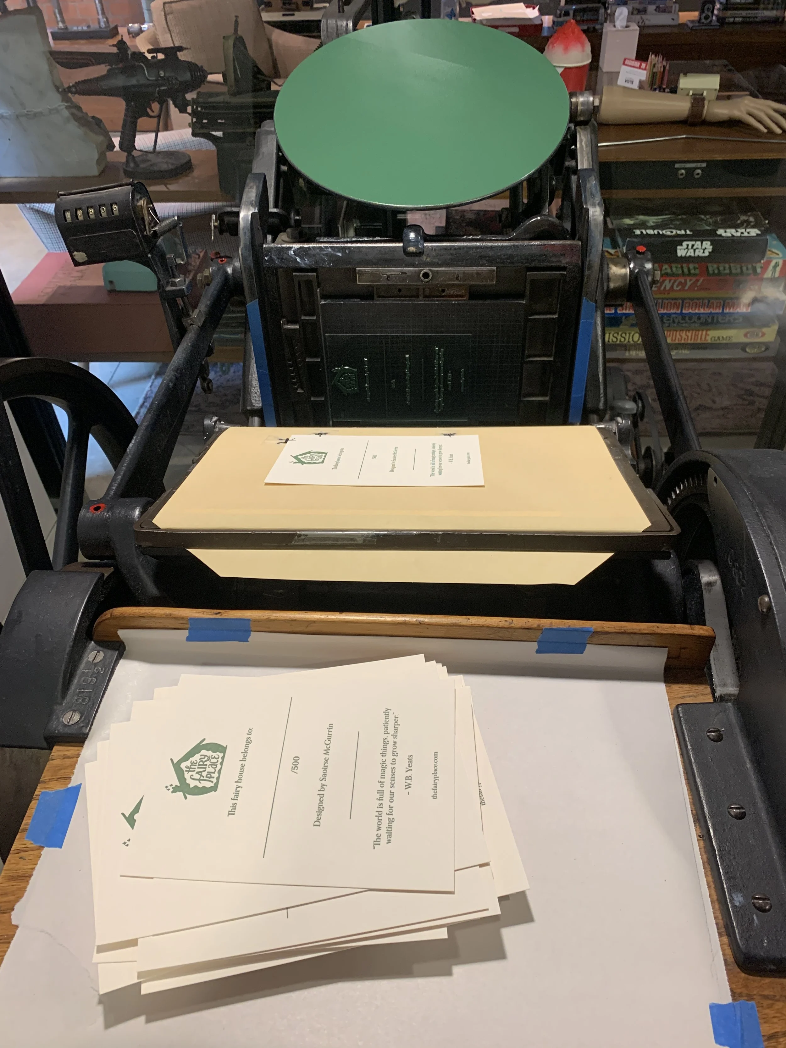
To support the handcrafted nature of the product, the process combined analog printing techniques, including screen printing and letter pressing, to create a tactile and cohesive system.
Execution
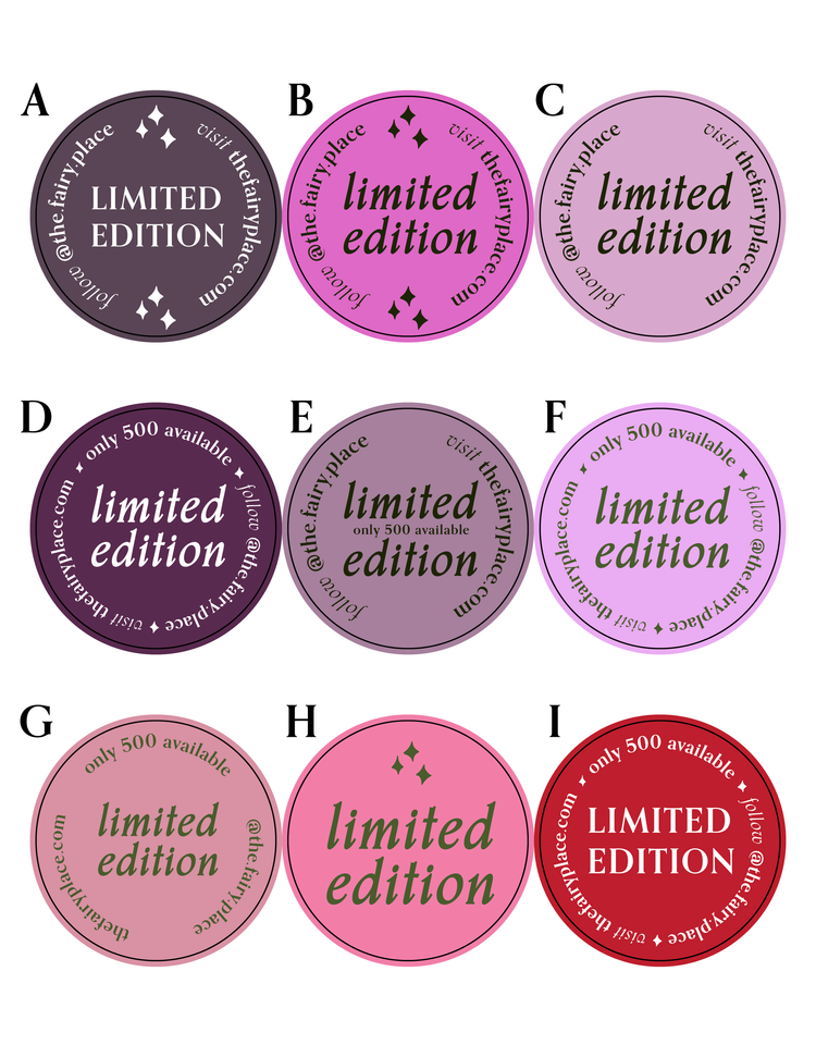
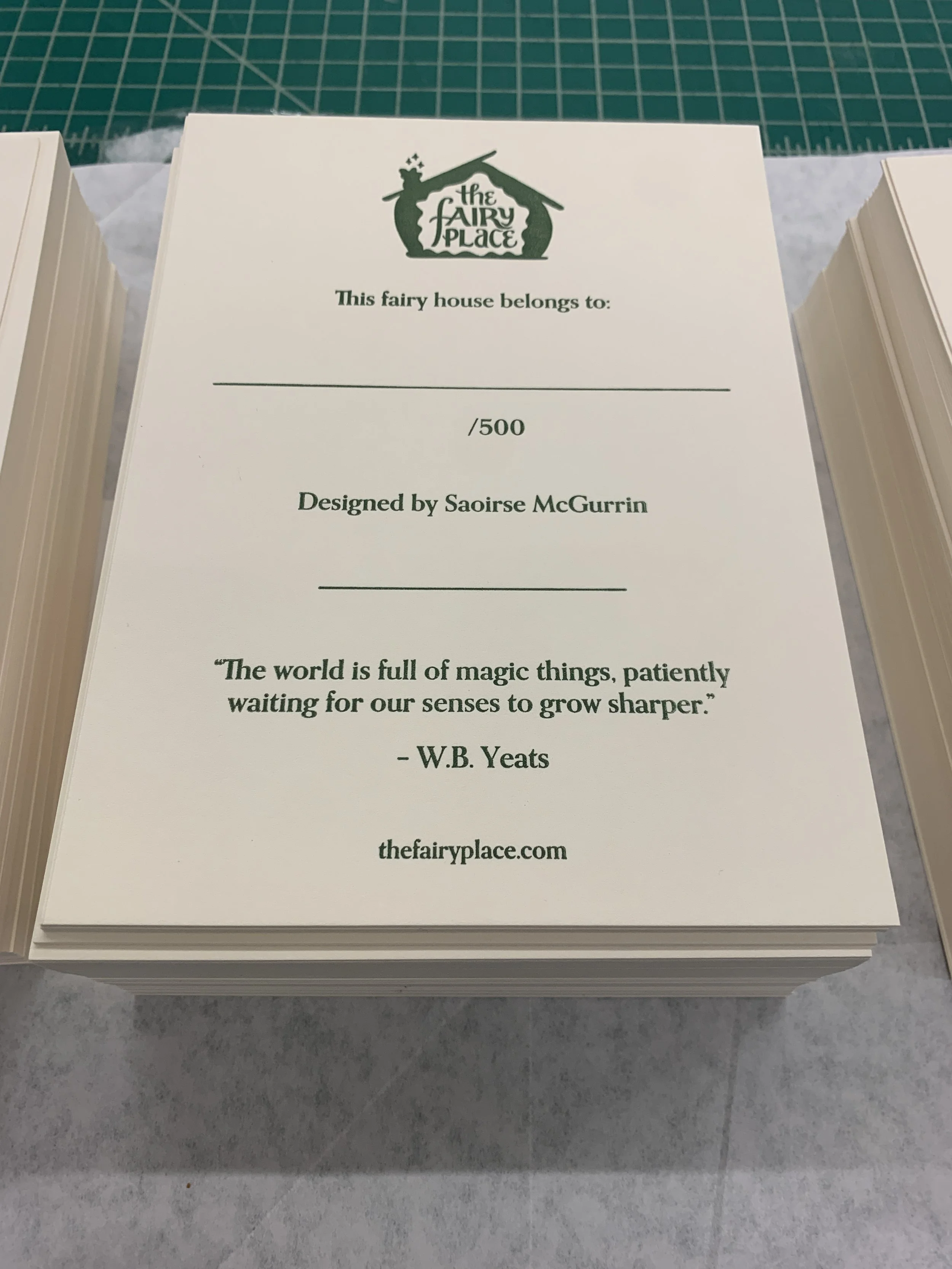
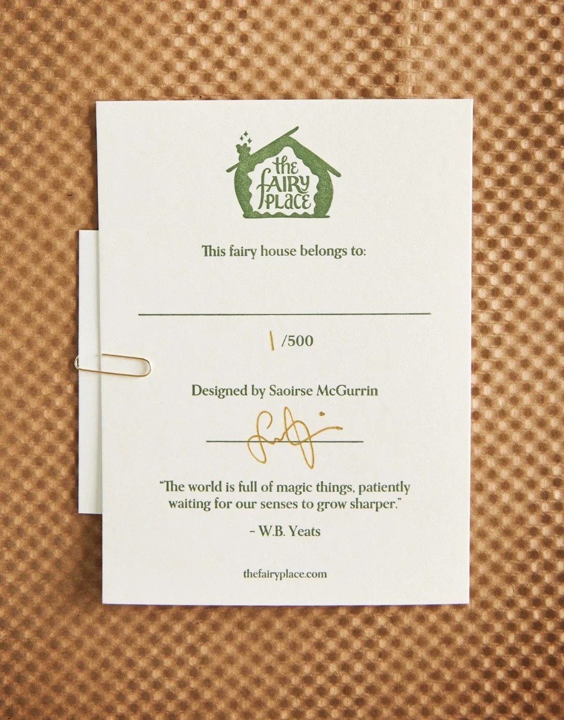
The final deliverables included logo design, packaging for multiple kit sizes, a certificate of authenticity, stickers, and branded materials. Each piece was produced with attention to craft and carefully selected materials to maintain consistency across all assets.
Outcome
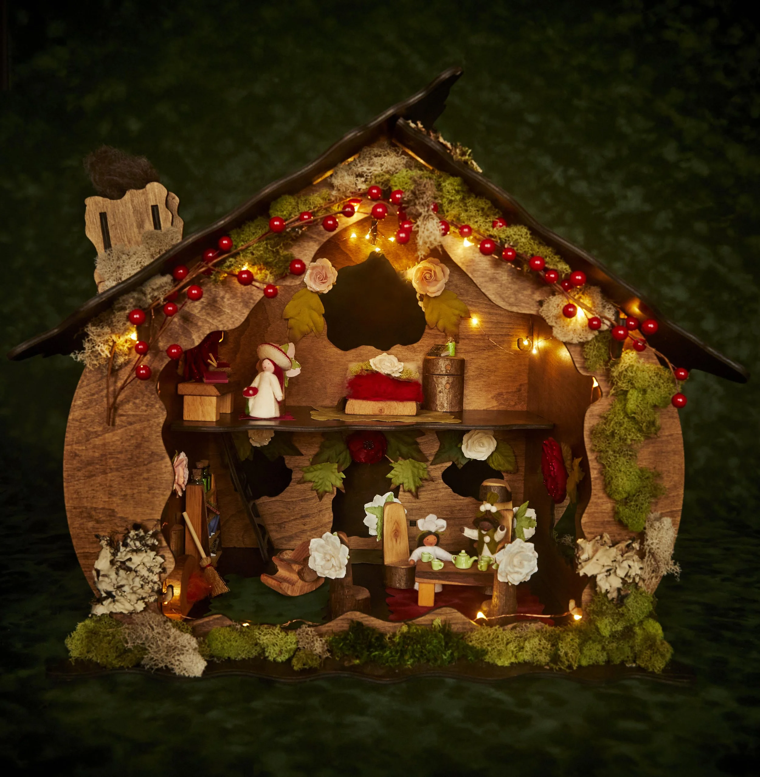
The result is a cohesive and expressive brand system that reflects the magic, uniqueness, and handmade quality of The Fairy Place, creating a consistent experience across both product and packaging.
THE PROCESS
Take a look at some of the design, production and printing processes. From sketches to screens and plates to custom illustrations.